Financial data is always interesting enough to attract data scientists and software developers because of its potential of producing value literally. If we succeed in finding novel insight from the data, it may give us financial benefits. Even if not, financial data analysis is a fun thing, and it’s worth trying.
Omaha is a Python library to make it easy to collect financial data from the internet.
We can easily collect financial metrics with this library such as net sales, CCC
I’m going to introduce how Omaha enables us to collect financial metrics without much trouble here alongside the.
Table Of Contents
- Prerequisites
- How to use it
- Collect Aggregated Metrics by Industry
- Illustration of Aggregated Financial Metrics
- Reference
Prerequisites
First of all, Omaha depends on external financial services. Buffett Code and Quandl. Omaha uses Buffett Code to get the aggregated financial metrics by financial quarter, and quandl for getting daily stock prices. These metrics are combined internally in Omaha.
Both services require us to register to use the API service. Please take a look at the official documentation for more detail.
- Buffett Code (Written in Japanese)
- Quandl
How to use it
Omaha is a library converting the data obtained from the API to another format. Pandas DataFrame is a typical format. Many data scientists are familiar with Pandas usage nowadays so that they can quickly get used to Omaha too. Let’s install the library first. As is often the case, you can install Omaha with pip.
$ pip install omaha
That’s it.
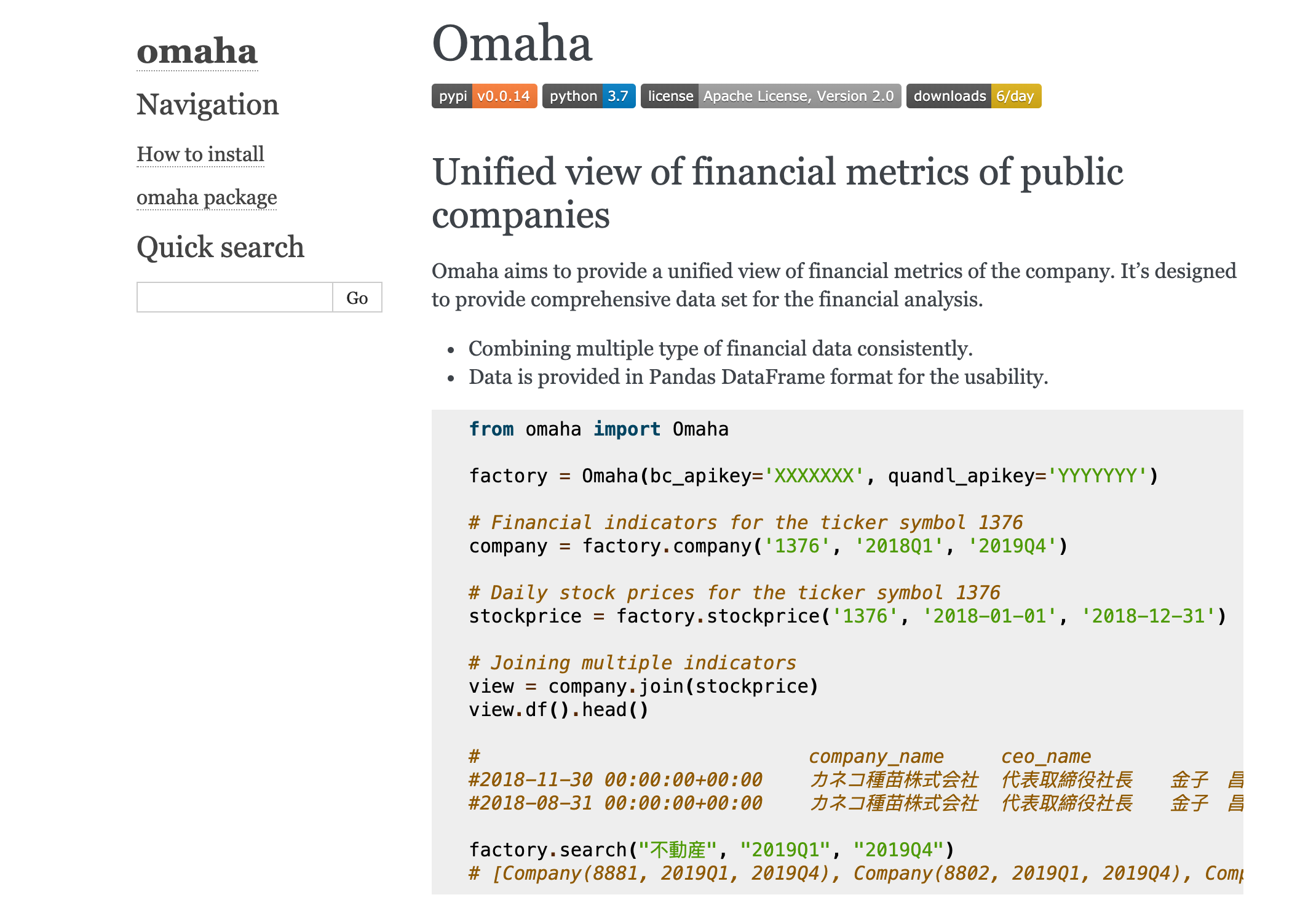
Omaha factory class is a primary endpoint to construct the fundamental abstractions of the financial component. It should be created with two API keys.
from omaha import Omaha
factory = Omaha(bc_apikey='XXXXXXX', quandl_apikey='YYYYYYY')
bc_apikey is an apikey for Buffett Code. quandl_apikey is an apikey for Quandl.
From this factory class, we can create an abstraction to communicate with external servers. For example, the following code creates a class downloading financial metrics from Q1, 2018 to Q4, 2019, for ticker symbol 1376.
# Financial metrics for the ticker symbol 1376
company = factory.company('1376', '2018Q1', '2019Q4')
The stock price is available with stockprice method.
# Daily stock prices for the ticker symbol 1376
stockprice = factory.stockprice('1376', '2018-01-01', '2018-12-31')
By combining these components, we can get a comprehensive view of the company.
# Joining multiple indicators by day.
view = company.join(stockprice)
view.df().head()

# company_name ceo_name headquarters_address ... Low Close
#2018-11-30 00:00:00+00:00 カネコ種苗株式会社 代表取締役社長 金子 昌彦 群馬県前橋市古市町一丁目50番地12 ... 1389.568777 1408.187823
#2018-08-31 00:00:00+00:00 カネコ種苗株式会社 代表取締役社長 金子 昌彦 群馬県前橋市古市町一丁目50番地12 ... 1479.188532 1479.188532
The exciting thing about Omaha is a search feature. search method gives us a list of companies matching with the given keyword.
factory.search("不動産", "2019Q1", "2019Q4")
# [Company(8881, 2019Q1, 2019Q4), Company(8802, 2019Q1, 2019Q4), Company(3465, 2019Q1, 2019Q4),...]
Also, category gives a list of companies belonging to the given category. The category must be one of the TSE33 industry.
factory.category('サービス業', '2019-01-01', '2019-12-31')
Okay, now let’s move on to see the real example of how the data look like.
Collect Aggregated Metrics by Industry
First, we will collect the financial metrics of the public company in the specific industry in Japan as follows.
category = 'サービス業'

companies = factory.category(category, '2017Q1', '2019Q4')

dfs = [for c.df() in companies]
Let’s create an aggregated DataFrame by averaging all metrics in the industry.
all_df = pd.concat(dfs)
aggregated_df = all_df.groupby(['fiscal_year', 'fiscal_quarter']).mean()
In this way, we can collect the aggregated financial metrics of the specific industry. We can
Illustration of Aggregated Financial Metrics
We can do anything once the data is available in the DataFrame format. Let’s take a look at the net sales of three industries, “Services”, “Fishery, Agriculture & Forestry”, and “Mining”. Here is the result. Y-axis represents the amount of net sales in yen.
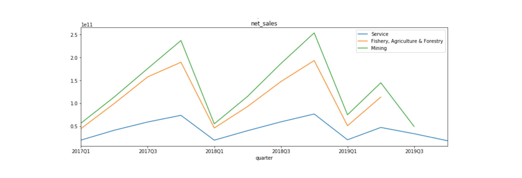
We can see a sort of periodic trend by quarters, and the mining industry produces the most net sales among the three. Generally, net sales are the primary indicator to measure the success of the company. We are now going to look at how each indicator correlates to net sales each other. The following char is the scatter plot showing the relationship between net sales and free cash flow (FCF).
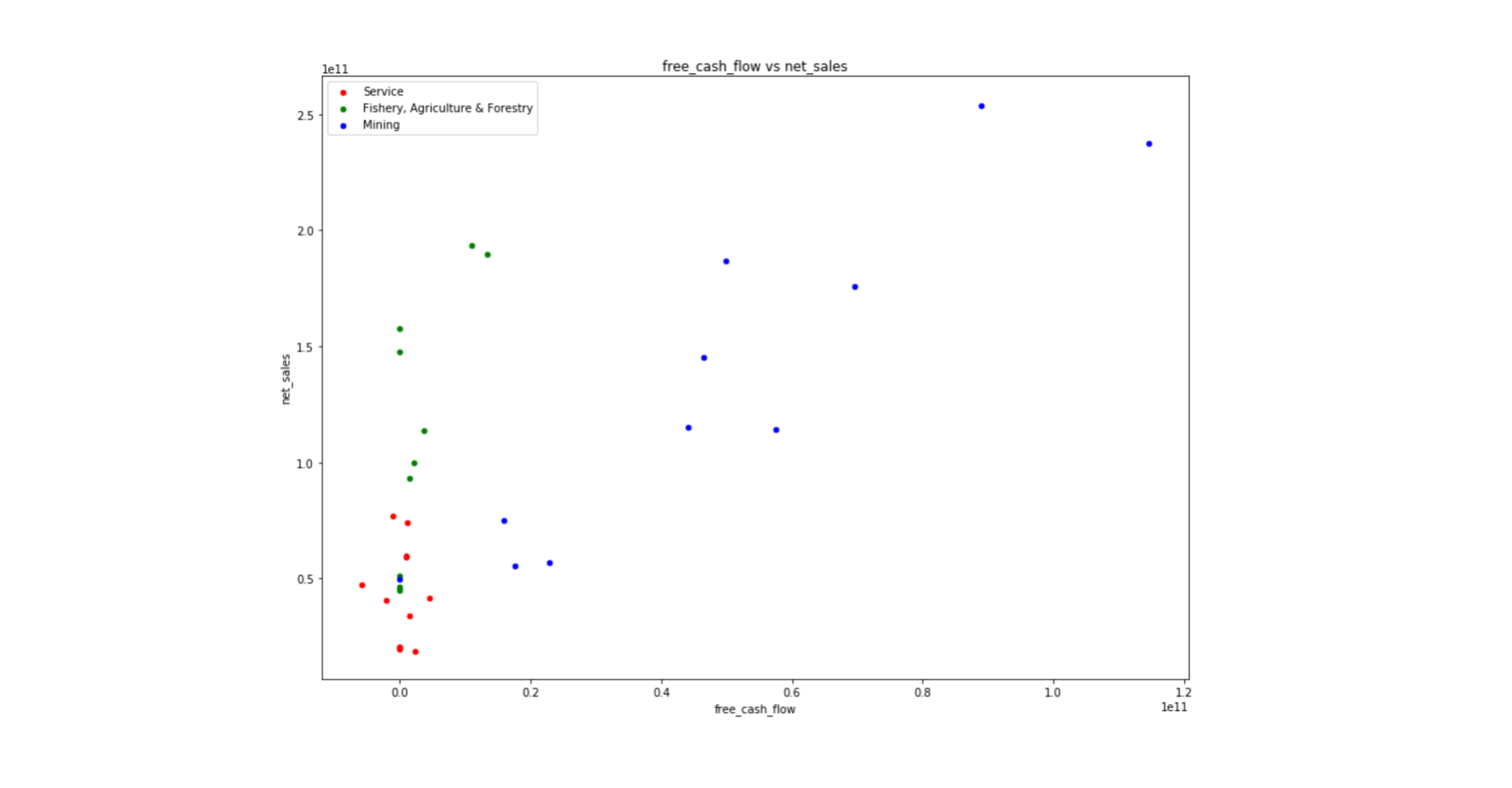
We can find the mining industry shows the strongest correlations between net sales and FCF. Strong net sales produce a substantial amount of cash flow in general. But the other two sectors do not show a positive relationship as much as the mining industry. That’s because these industries tend to have higher debt or investment than the mining industry.
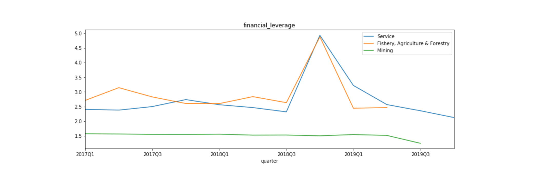
As the above chart shows, the financial leverage of these two industries is higher than the mining industry. It can contribute to putting the pressure on the FCF payback of the debt.
Of course, the hypothesis may be wrong. Please research by yourself with Omaha like this. We do have not only data but also the tool to access without paying much cost.
Please give me some feedback if you find it useful or not for your analysis.
Thanks as usual!
Reference
Image by Gerd Altmann from Pixabay